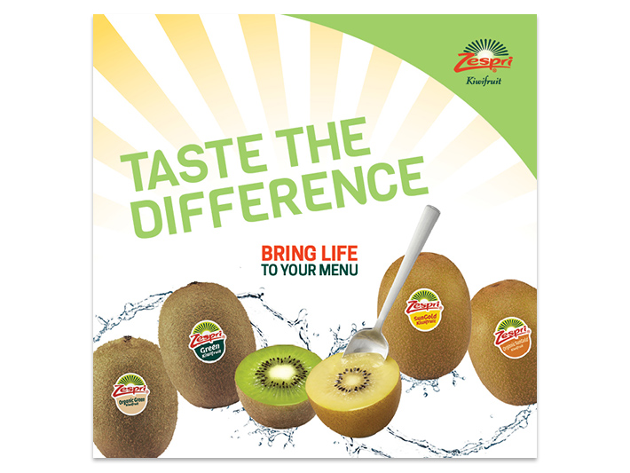
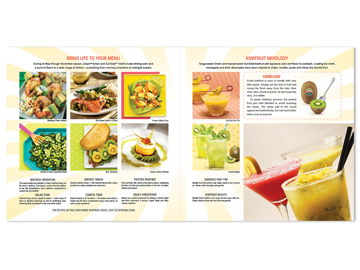
“Taste the Difference” and “Bring Life to your Menu” were key taglines given for the Zespri Kiwifruit brochure, and it was up to me to “bring life” to this tasty project.
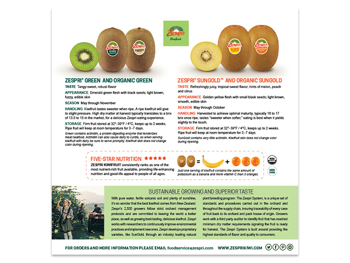
Challenge: Which images represented the copy provided, and how best to communicate & organize the product details in an easy to read format.
Solution: Brand colors were used throughout to emphasize “Green” and “SunGold” kiwifruit, yellow rays of light (life) were used as the backdrop of the images in the center spread, and nutrition & handling information were highlighted by placing them in a box with a dashed line.


